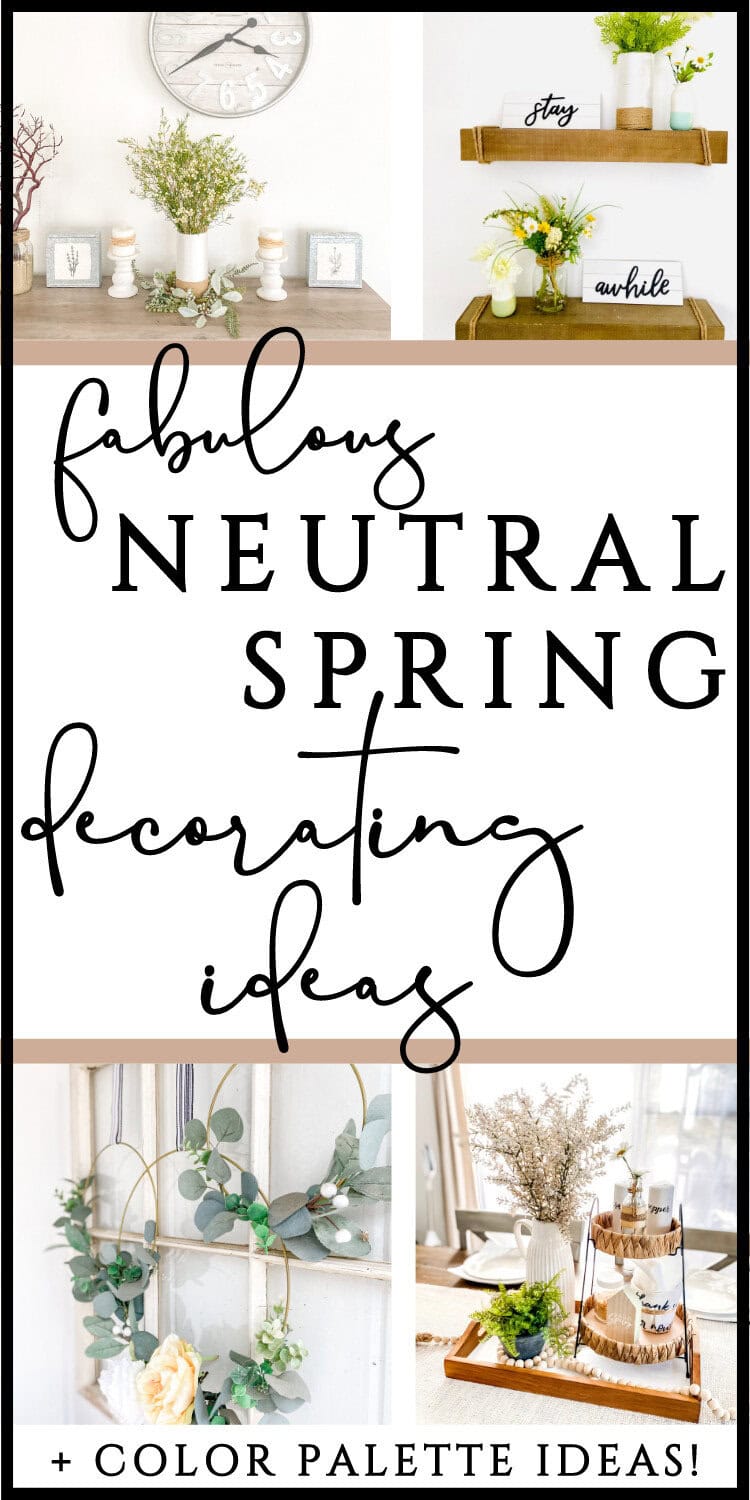
Soft & Pretty Neutral Spring Decor Ideas + Color Palettes
If you are a fan of neutral farmhouse decor and want to decorate for spring, take a look! I’ll walk you through how I decorated my home in a mix of rustic, cottagecore, and modern farmhouse chic styles, using a mostly neutral palette for a calming yet cheerful space!
Neutral Spring, Farmhouse Style
I’m always a sucker for spring. I grew up in New York and moved to Tennessee about 4 years ago. We still have winter here, but it’s shorter – and seriously – I could go even shorter. But I’ll take it over NY any day.
As soon as we cross February 14th off the calendar, I’m officially taking down the remnants of winter decor and transitioning to spring (check out how I decorate for Valentine’s Day here and also here so it’s a seamless switch and that decor serves as an amazing place holder until spring is in full effect!).
This year, I wanted to go with neutral colors for spring. The fresh market flowers had a lot of colors, which I loved when I did it, and last year I stayed with a lot of pinks from Valentine’s Day, which I also loved.
But this year, I wanted to go with a little more of a neutral color scheme for spring.
This post contains affiliate links. See Disclosures for details.
Neutral Spring Color Palette
Let me define what I personally mean by neutral, since a lot of people think it’s just tans and whites and greys. Well, yes, that’s part of it- but for me, it’s leaving out the bright colors. It has a more earthy, soft feel. It’s toned down. Calming. Serene.
There are a few ways you can go with neutral spring – soft greens and yellows that are almost in the cream family – you even can use toned-down blues, pinks, and terra cotta type colors.
Let me share a few examples.
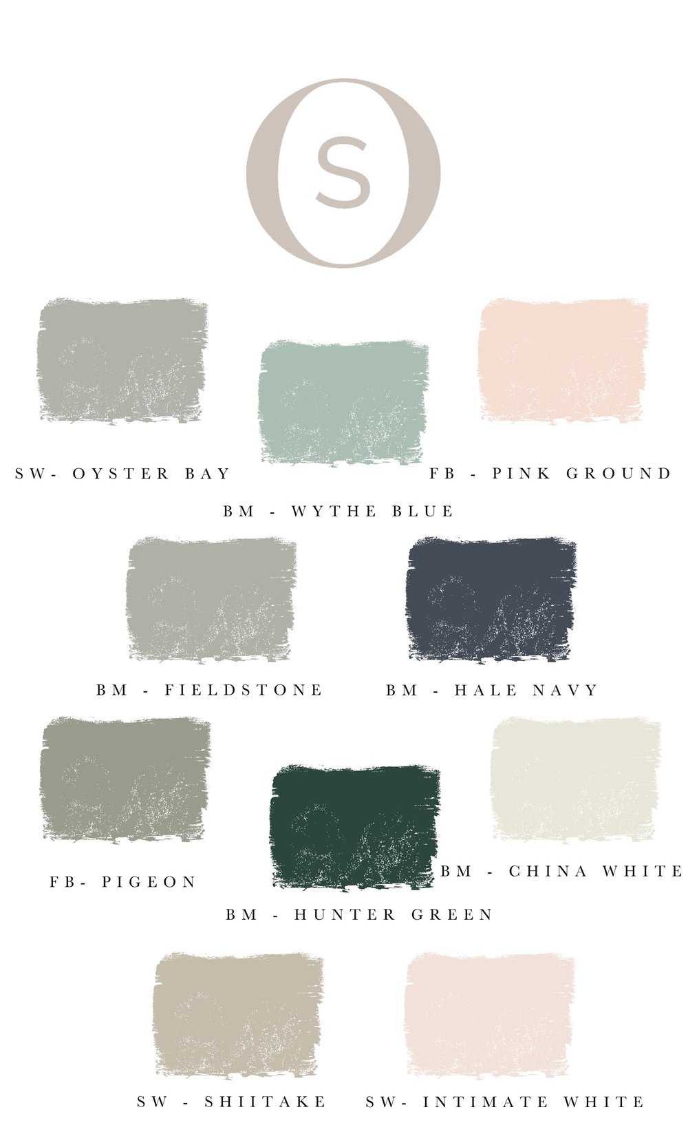
Studio Onyx shares this color palette for spring:
This one on Pinterest is another example:

Here’s one more to inspire you from Behr:

Personally, I incorporate soft greens and yellows that lean toward the neutral end of the spectrum – muted versions of those colors. To me, it’s soft, tones that can blend in a lot of directions.
The one exception would be my fireplace mantel, as I wanted to go with a more wildflower, garden-y type feel this year.
But you have freedom to go neutral in one area of the house and move in a different direction in another room, if that fits the decor and feel of those spaces.
IF you happen to love a light and airy feel, especially for spring, come check out some tips and spring pictures here!
Neutral Rustic Spring Home Tour
So, let me walk you through my home and show you what I did. I’m going to give you all my lazy-girl decorating hacks as well as some tips for where to get budget-friendly decor.
Porch

If you’ve seen my other posts, you know that there are a few things that are staples here – the Blessing sign from Numbers 6:24-26 (hung before Kari Job made it popular) on the left and the old window pane on the right. I’ve never taken either down. The wreaths on the window stay all year, too – I just change out the clip-on embellishments.
I use the Adirondack chair a lot as well, switching out the pillows, because it takes up a lot of room, which means less pieces of little decor.
I stuck with the yellow and green theme with the wreath (Marshalls), the DIY beaded wreath on the wall, and the flowers clipped on to the hoop wreath (Dollar Tree!).
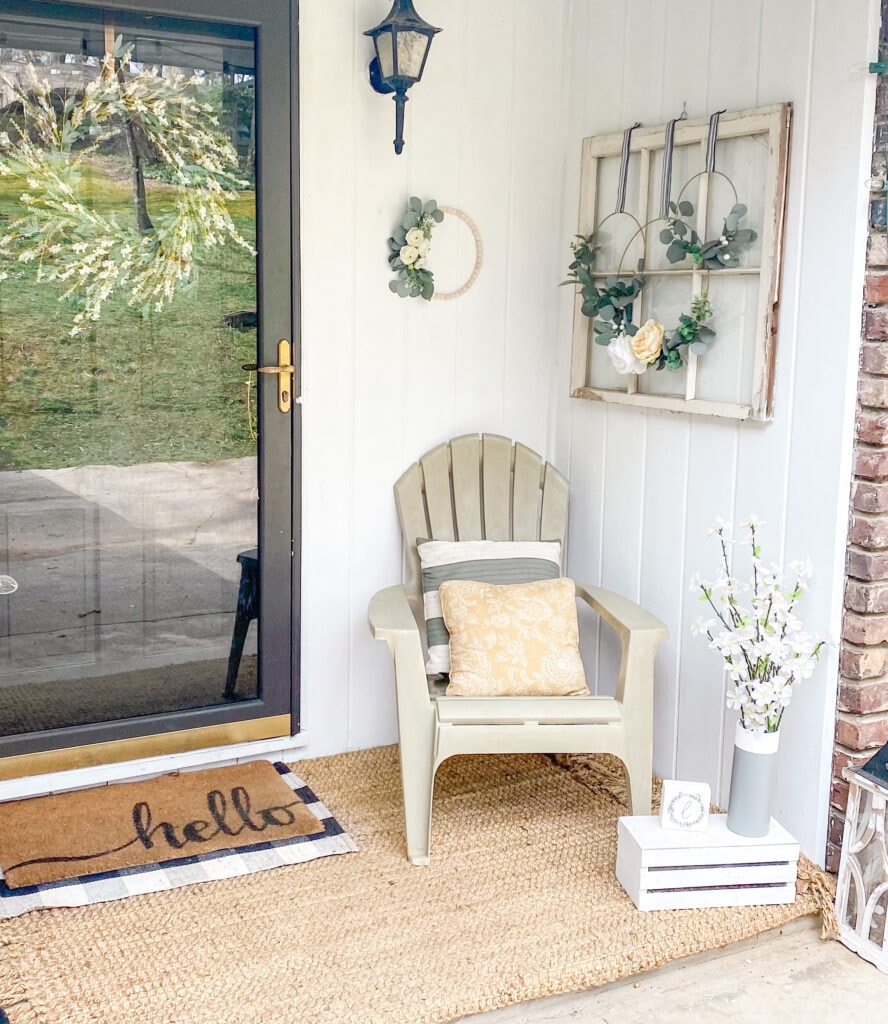


The dogwood stems were from Dollar Tree as well, in a repurposed Grove Collective Spray Bottle Container. I use whatever I have handy!

Entry Way Wall
This wall is really just past the entry way, but it is one of the first things you’ll see if you walk in my home.
The sign is a printable from my Etsy shop, and I put it out right after Christmas and it stays until late spring.
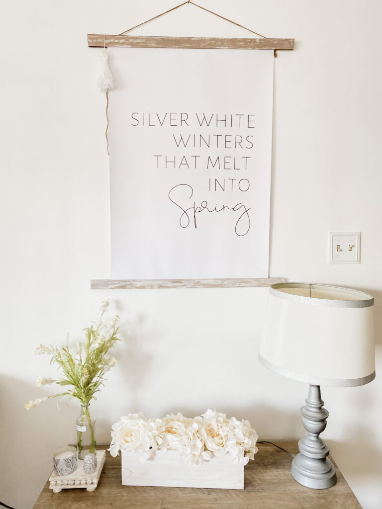
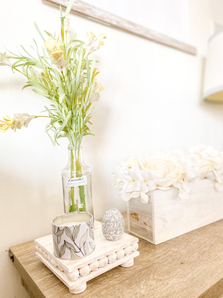
Below is a box of flowers I purchased at TJ Maxx. On the riser (a DIY), I used some Hobby Lobby faux flowers in a glass bottle, paired with a tin candle from Target dollar spot and a concrete egg from Walmart.
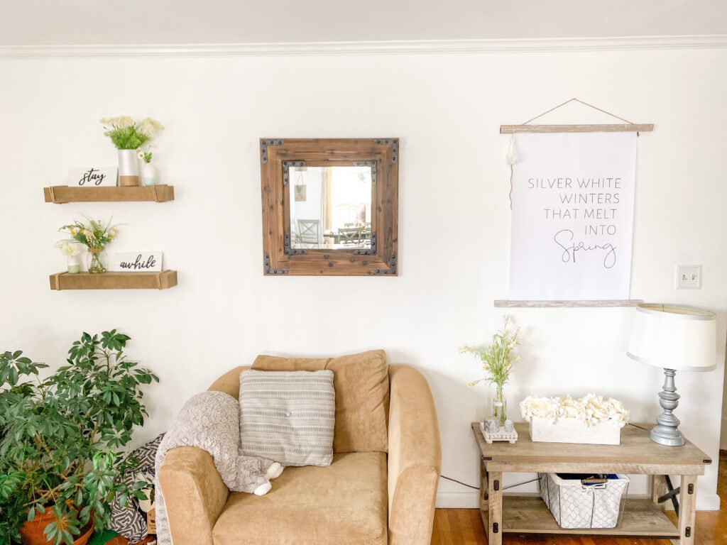
There’s a wood mirror in the middle of the wall, moving to the left, and just past that is floating shelves.
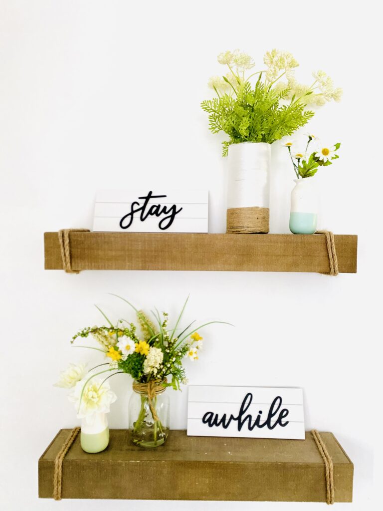
Still sticking with the yellow and green, I have neutral-colored white flowers in a DIY vase I made from Dollar Tree materials. The signs were from Target Dollar Spot, and the small pottery vases were from Kroger. Yes, Kroger.
Long Wall in Living Room
Next, I’ll show you I styled the long wall. If you’re facing the entryway wall, it’s to the right. We have a ranch style home, so this is a big wall that runs through the middle of the house.
It’s a little challenging to style it but I broke it up into 3 areas: Shelf and TV Stand, Hookboard Middle Transition Space, Cube Cabinet.
Shelf & TV Stand

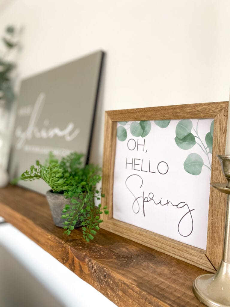
The sign in Evergreen Fog on this shelf will stay all year, as it’s sort of my word/verse of the year, and I wanted it front and center as a reminder.
Lots of green for spring here, but to me, green says new life and though it’s not necessarily neutral, it’s not overbearing as a dominant color scheme but just sort of blends in a natural way.
The“Oh Hello Spring” sign is also from my Etsy shop!
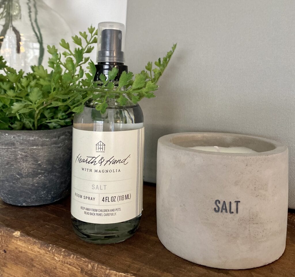
And can I tell you how much I am loving that Salt concrete candle and room spray from Hearth and Hand? It’s like the beach poured into a concrete holder, with some sunshine and breezy light florals mixed in. The style fits right in with the neural decor as well! (You can see more of my spring favorites here!)
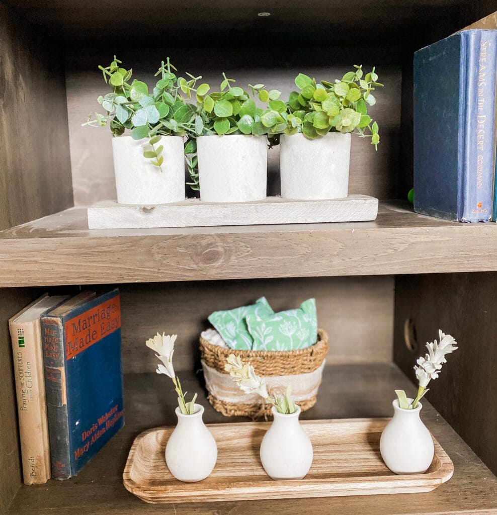
Below, on the shelves on the TV stands, I also used small pottery vases that I got from Target Dollar Spot with the same Hobby Lobby stems. The tray was also from Target Dollar Spot. The basket behind are filled with pillows I made from a Target dishtowel (do you see a theme yet?).
Hookboard
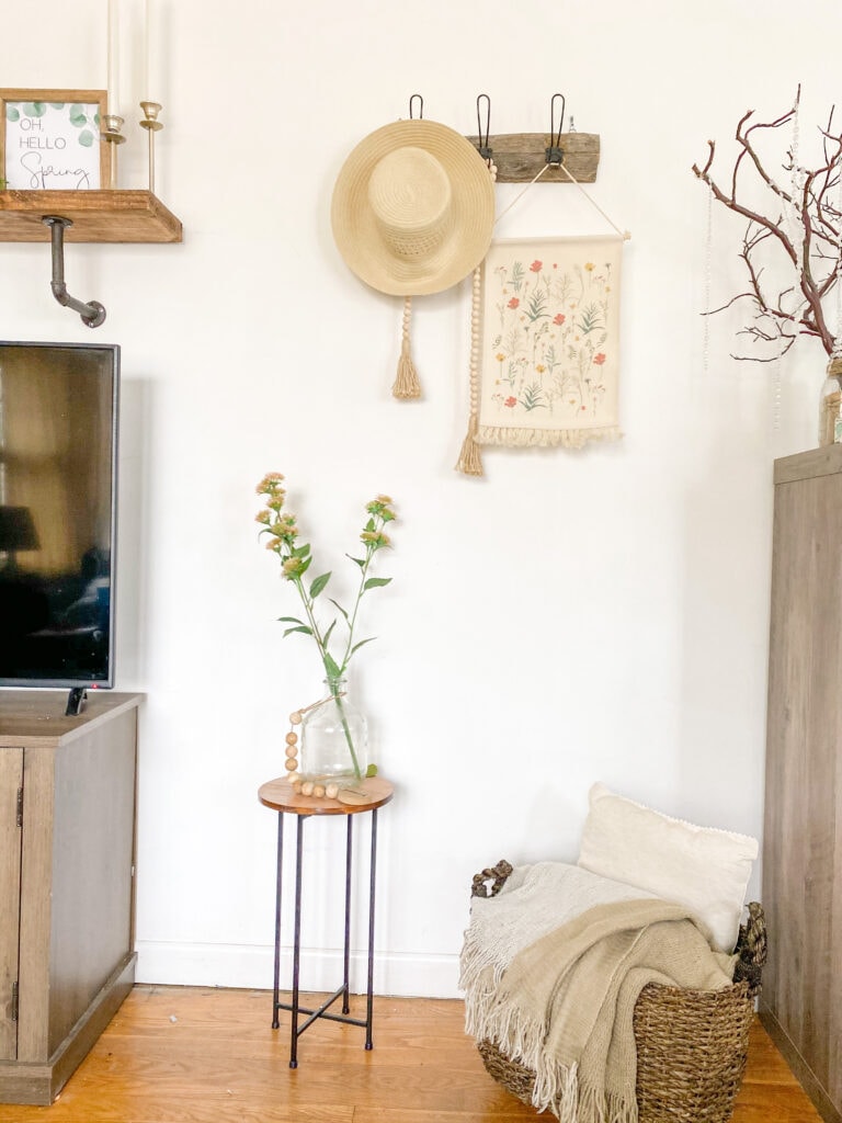
Next to the shelf is this hookboard. The hat and the canvas hanging are from Target Dollar Spot and I love the garden-y wildflower theme. Again, it’s not standard neutral, but it’s not overbearing in any way and stays true to those earthy tones.
This is one of my favorite little cottagecore spaces.

Here’s a somewhat imperfect picture that give you an idea of the layout.
Cube Cabinet

This area used to be a lot more complex before I smartened up and got fabric containers to hold all of my sons’ toys. It was a win for everyone – less to decorate, less clutter in front of my eyes.
On top is another Dollar Tree DIY vase. The galvanized signs were Hobby Lobby clearance, and the candlesticks are upcycled from Target Dollar Spot.
I love using baby’s breath for spring decor – cheap, lasts long, and a truly rustic and cottagecore feel.
Here’s another version of how I updated this space after I did a few DIYs. I decoupaged these wood boxes from Dollar Tree and filled them with various bottles and bud vases, and I love how they turned out. I also used the baking soda paint method to paint a thrift flip oversized bowl.

Dining Table
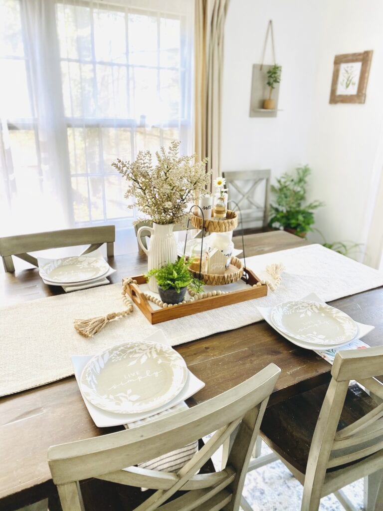
You can read here how I put together my entire spring tablescape to make it stylish and functional, but you can see that I used a lot of green along with the neutral colors, and that’s how I added life to what some might call a boring color palette.

This area is very functional for us now, with an anchored centerpiece tray that can easily be removed when we need to use the table.
Tiered Tray
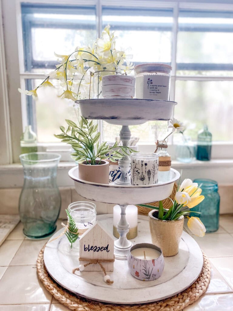
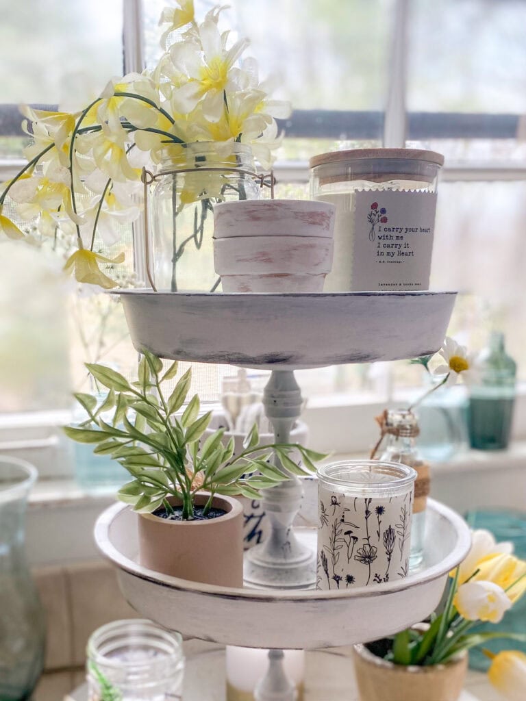
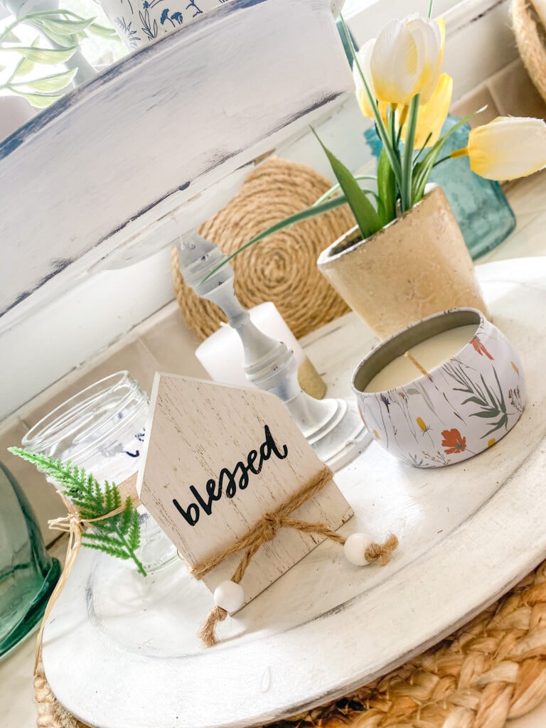
This tray is usually in on my coffee bar, but I rarely add anything that has to do with coffee. It’s more or less just something to decorate, and again, you can see how I went with yellow flowers and other neutral decor. I’m not big on cutesy, so just a few pieces in here to add a soft, rustic feel.
I moved it to the window for better lighting for photographing.
Mantel

OK, you can see here how I went with some bright colors. Still yellow, but to me, forsythias are the quintessential harbinger of spring, and I really wanted a statement. The bricks background is a little busy (still troubleshooting that), so I’m usually struggling to find something that stands out but doesn’t feel too noisy.
The “Welcome Spring” print is from my Etsy shop, and this year, I was just feeling the bright, wildflower colors to go along with the forsythias. I added in some terra cotta pieces to add to the garden feel, and while it’s not overtly neutral, this area is off by itself, so personally, I have no problem with it being something of an outlier.

The natural wood tones for the candles, picture frame, beads and even on the cover of the candle add to the neutral feel. The wild-ish garland ties in the flowers in the print and the forsythias for a natural wildflower garden feel.
More Rustic Spring Decor Ideas
If you love rustic farmhouse decor and need more inspiration for spring, I’ve got you covered! Take a look below for more ideas!
30 Breathtaking Spring Tablescapes and Centerpiece Ideas
30 Best Spring Farmhouse Mantel Ideas You Need to See
30+ Farmhouse Spring Porches You’ll Fall in Love With
25 Rustic Farmhouse Spring Decor Ideas that are So Simple to Recreate!
25 Farmhouse DIY Projects You Need in Your Home This Spring!
25 DIY Spring Wreaths in Rustic Farmhouse Style (The Prettiest Ones Out There!)
If you go with neutral spring decor this year or include any of the ideas from any of the posts, I’d love to see them! Tag me on Instagram @100affections or leave a comment on Pinterest!
Other thoughts? I’d love to hear them! Leave a comment below!





I love all your vignettes, and appreciate how you laid out what “neutral” color schemes can really look like! We just got our floors resurfaced so I’m attempting to transition our home color scheme in to more neutrals. Your post gave me the perfect inspo as to how to switch things up for spring – thanks!
Thank you so much, Amelia! I’m so glad you found something you can use in here! So appreciate you coming by and commenting! 🙂